

Designing Goal-Oriented User Onboarding in 4 Steps
Designing Goal-Oriented User Onboarding in 4 Steps
This article was originally posted on the AppCues Blog on Nov 22, 2016

This article was originally posted on the AppCues Blog on Nov 22, 2016
We product designers have been seduced by trends. The prevalence of welcome messages and product tutorial screens in user onboarding has created the illusion that they are the best means of getting users to your Aha! moment, but they are just one approach of many.
Choose the right approach and actively show users that your product or service is a must-have experience. Choose the wrong approach and create friction just as they are deciding whether or not to make your product a part of their lives. Given that the average app can lose up to 86% of its users in the first use, the stakes are high.
Thankfully, thinking through the lens of “Goal-Oriented Onboarding” can help you identify the right actions to build your onboarding around and pick the right approach, all in the name of driving users to your core value as efficiently as possible.
Avoiding the Tutorial Trap
Google “app onboarding” and you’ll see endless pictures of attractive welcome or tutorial screens.

There’s a lot to admire in a good welcome screen — they’re often beautifully designed, with nice use of color, imagery, and concise text. Since they are added at the beginning of your app’s experience, designing tutorials can offer a lot of creative freedom for designers and can be implemented with minimum disruption to your core interface or user flows.
But the tutorial screen’s popularity and often beautiful execution can give the wrong impression: onboarding isn’t a particular type of screen, but the strategy you employ to get your users to discover your app’s core value quickly and efficiently.User onboarding helps you convert new users into regular users before losing them for good. And tutorial screens are not always the most effective tool for the job.
Many teams discover that users just swipe “through the tutorial without reading any of the copy,” as Vevo found through user testing. A participant for a RetailMeNot user test once said “I just want to get in the app and start exploring.”
I’ve received similar user feedback at Hopper. If users are not engaging with the content but just swiping through your onboarding screens, you are adding friction and risk undermining your product’s true value.
I call this the Tutorial Trap: any instance in which we apply an onboarding UI pattern without clear goals in mind and without an understanding of their effectiveness. The trap is that it focuses on the means over the ends with potentially tragic results.
Goal-Oriented Onboarding, or GOO for short, can help you avoid the Tutorial Trap. GOO has four key steps:
Drive users towards specific, key actions
Focus your product around onboarding first
Add new UI where it’s most needed
Analyze, adjust, and repeat
Focusing on GOO will help you design a user onboarding experience that not only looks beautiful, but will also drive results for your business.
1) Drive Users Towards Specific, Key Actions
A good onboarding experience makes it as easy as possible for new users to take meaningful actions. For actions to be considered meaningful, you should have an opinion (or a best guess) as to what steps are most impactful for user activation and eventually your business.
You’ll want to combine whatever qualitative and quantitative data you have to identify these steps, with the aim of further validating or invalidating your understanding of what drives user success.
Don’t go too far down the funnel to find your key actions. The steps you want to drive users towards in onboarding aren’t necessarily your main conversion metrics. You’ll want “day one” actions that are low-effort, high-value.
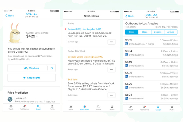
At Hopper, booking a flight is our ultimate conversion, but is too high of a commitment to expect from a first-time user. Booking also isn’t really a good expression of our value prop either, which is predicting when users should fly or buy their plane tickets to get the lowest fares. Our airfare predictions often recommend waiting to book to take advantage of a price drop later.
The ability to make good on the promise of a future cheap fare, and help users save money, is our real Aha! moment. Buying on first use might obscure this, despite being one of our core success metrics in the user lifecycle.

Instead, our onboarding action is what we call “watching”, where users decide to follow prices so that they’ll be notified when prices hit the predicted low. It is a much lower commitment and we can drive users to it in just a few steps. It also gives us permission to contact them about something they are interested in later, ensuring future value.
Your most effective actions might not be what you initially expect, so you may have to experiment a few times before getting it right.
2) Focus Your Product Around Onboarding First
Once you have identified a potential action to focus on, don’t start adding onboarding UI patterns just yet. First, make sure your product is as supportive of your onboarding journey as it can be.
I like to start by making an onboarding list of the steps users currently have to take to perform these key actions. Once I have a list, I analyze where it is too long, or too complicated, and see if there is room to remove steps or make the intended actions clearer or more compelling along the way.
A good range to aim for is anywhere between 3–7 steps as suggested in the concept of “chunking”, for easy cognitive processing and memorization. While there are certainly exceptions to this rule, having too many steps will overwhelm users or obfuscate your main point.
For Hopper, we got our list down to only three steps users needed to do to perform our key action:
search for an origin and destination
select travel dates
press the watch button on the prediction screen

For this to happen, we had to ensure that the search screen was the first one users saw on install, the search action was obvious to perform, it was really clear how to select dates, and the watch button was the most prominent on the prediction screen. This required altering our existing screen’s layouts, interfaces, and interactions.

You’ll have to weigh trade-offs in making such core app decisions, but, if you can, doing it up front will help both your onboarding and overall app experience.
3) Add New UI Where It’s Most Needed
When you feel your app is doing the best it can to help drive first-time users to ideal behavior, test it. Put it in front of people and see where they get distracted or confused.
Whatever you did in the previous step is still likely too subtle, and testing it at this stage will help surface how you can reinforce it. This doesn’t need to be incredibly time consuming; you’ll likely pick up on key trends pretty quickly, in as few as 5 users for some.
Take what you learn and use it to fill in the onboarding gaps left in your product with new UI patterns specifically for first-time users. There are plenty of interface patterns to chose from — aim for the methods that best communicate your value and drive users to your key actions.
For Hopper, we found action-driven tooltips were just the thing we needed. These UI elements lay on top of the app interface, with an arrow pointing to a key element, and prompt a desired action.

We used one tooltip for each of the three steps in our onboarding flow, pointing out the one action that would move them to the next screen.
4) Analyze, Adjust, and Repeat
Building your onboarding flow isn’t enough. Make sure to have a plan for event tracking and analytics. This insight will help you know if you did in fact build your onboarding around the right action(s) in step 1, or if you should refine your flow further in steps 2 or 3.
Onboarding is not that different than building a product more broadly; you should be prepared to hypothesize, iterate, test, and adapt quickly based off of what you learn.
Focus On Ends Over Means
Welcome screens are the means, not the end of user onboarding. They are one tactic of many to drive users to high-value actions that keep them coming back for more. Goal-Oriented Onboarding is a simple way to think about how to approach user onboarding to achieve tangible goals and choose only the right tools for the job.
If you focus on getting users to perform low-effort, high-value actions right away, you will have a higher chance of getting them to make bigger commitments later as they engage deeper in the product.
There is no one-size fits all scheme for onboarding, so this will likely need some care and iteration, but doing so will put you a step ahead of much of your competition. Design with intention; design with goals in mind.
— Pantelis Korovilas (pakdsgn.com), Lead Product Designer at Hopper
Hopper is an award-winning mobile app that offers airfare prediction to help you buy your plane tickets at the best times.
We’re hiring a Mobile Product Designer to join me at Hopper! Click on our Jobs page to apply and for more information.